"Having all the equipment means there's nothing that's farmed out—I do everything. That makes it quite financially feasible."—Evan Baden, on his DIY book press.
White: A Color So Universal it Became Ignorable
In Steven Pinker’s 2003 TED talk “Human nature and the blank slate,” he makes mention of a list of ‘human universals,’ developed by anthropologist Donald Brown, as part of his argument against the tabula rasa theory of mankind. Intending to include all the human behaviors, emotions, and ways of relating to the world that defy dependency on culture, location or time, Brown’s list is essentially an aggregate of features evidently implicit in the human experience. While some are immediately apparent — for example, affection, weapons, weather — some of the more abstract notions may need a bit of contemplation to fully grok… The color white?!
Color is a naturally occurring phenomenon, essentially an experience of light and perception, yet since time immemorial, people have attempted to harness and manipulate the power of color for their own purposes, bringing color into mankind’s culture. Whether thinking of the ancient use of ochre or charcoal for cave drawings, or the early alchemical attempts to change what was viewed as the essence of an object by changing its color, or the contemporary use of color for the curious concept of ‘branding,’ it’s clear that it’s fundamentally human to engage with color. The range of colors is arguably up for debate, however, though white, along with black, enjoys universal status.
In contemporary times in this Western world, white holds a strange place. Serving as the default color for gallery walls and web pages, the starting point for digital documents of almost any kind, white is apparently valued for its ability to be an ignorable backdrop to the real content. And, just as white is used for the color of projection screens for movies and presentations, an ‘empty’ surface waiting to be filled, it similarly serves as a starting point for our modern minds, a space for us to project our own thoughts, our own selves. The white of a canvas invites color, to the extent that white doesn’t appear so much as a color as it does a sign of incompleteness. It serves so well as a starting point that it’s hard to remember that white is even a color.
Yet, it is a color. Many, in fact.
I was thinking of the color white, again and again, after seeing an exhibition at the K20 museum in Düsseldorf, ‘The Infinite White Abyss,’ which focused on the varieties and value in the color white, based on the work from three iconic painters: Wassily Kandinsky, Kazimir Malevich, and Piet Mondrian. Each of these three painters took a different approaches to painting, though they all worked with similar conceptual abstractions of shape and color. And, they each worked with a critical and integral use of white.
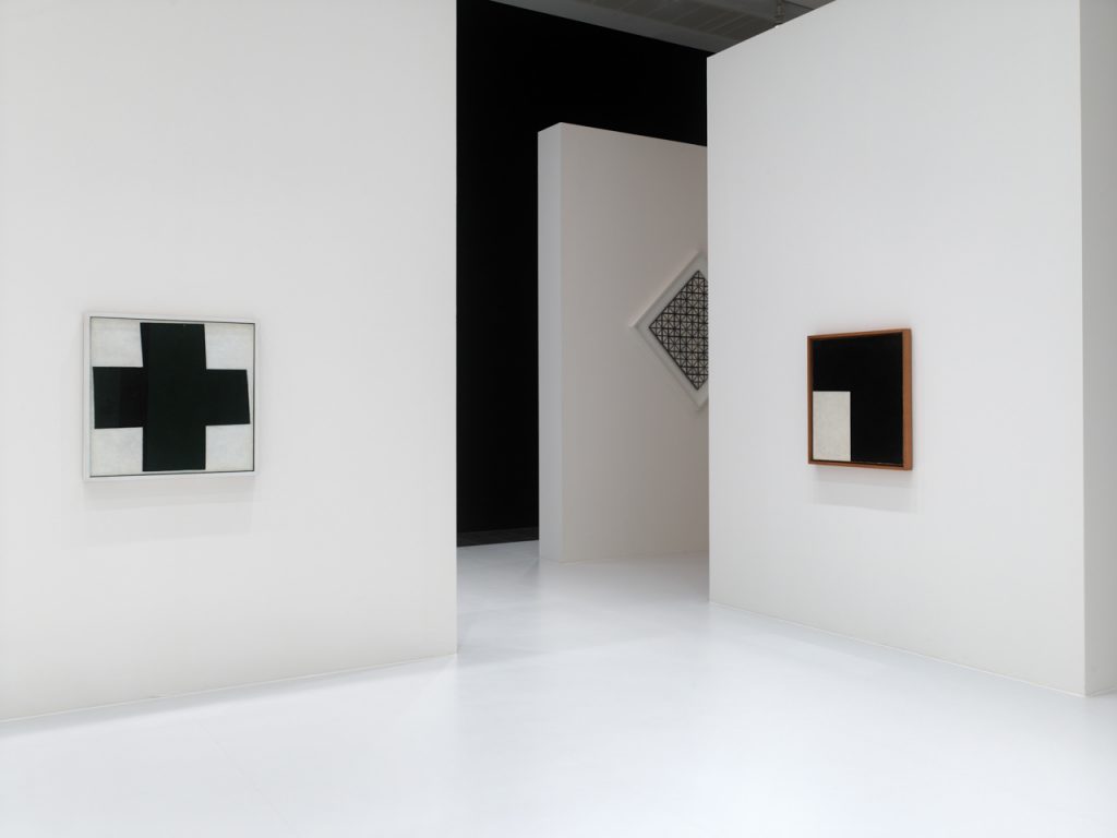
Kandinsky, Malevich, Mondrian — The Infinite White Abyss. Courtesy K20.
The white, empty abyss, infinity lies before us,” Malevich proclaimed in 1919, effectively summing up this vast feeling of interactivity between white and our minds. Infinity gives our minds their instruction. Put another way, white is a directive: the emptiness must be filled. When viewing white on a canvas, the mind goes to work, and artists are cognizant of this, using it skillfully in some works of art to require the viewer to be engaged as a co-creator in the work.
Black can have a similar effect, however inverse. Belgian artist Frederik de Wilde is currently working on the development of a color that he describes as the blackest black — a hue absent of any and all light. It’s perhaps unsurprising that he names Malevich as one of his sources of inspiration.
When viewing the works of these artists — Kandinsky, Malevich, and Mondrian — one after the other, seeing all these works of colors and squares and lines and squiggles, each of the works does more than stand on its own, it serves as a word or a sentence in an ongoing conversation. With the idea primed in mind to consider ‘white’, it becomes immediately apparent that white is rarely, if ever, simply white.
In Kandinsky’s ‘Painting With White Form’ (1913), the so-called ‘white form’ is actually rather stone-greyish. Thick, cream colored squiggles along the top give the form its highlight, while the shadow along the bottom is something of a pastel green. The white of his ‘Painting With White Border’ (1913) looks more like a thin whitewash layer on top of a rosy clay color. Meanwhile the white border surrounding Malevich’s ‘Black Square’ (1915) looks like a dirty subway white, the minute traces of thousands of soiled handprints having dissolved into the white to form something recognizable as a color that used to be white.
When looking at Mondrian’s precisely geometric work, for example his 1931 painting ‘Lozenge Composition With Two Lines,’ his whites seems surprisingly… white. They’re cracked and faded, to be sure, but there’s a certain clarity in the white that feels remarkably uncolored.
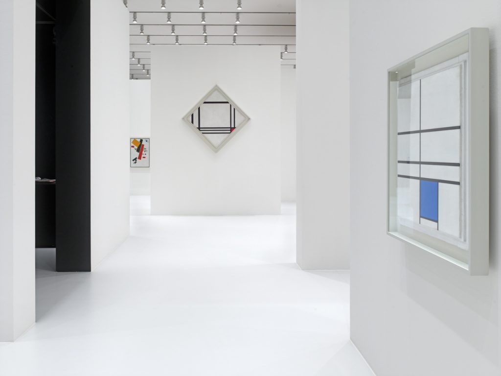
Kandinsky, Malevich, Mondrian — The Infinite White Abyss. Courtesy K20.
This act of viewing an object to ascertain its exact color is rather complex. It’s perhaps hard to do with white, except when comparing one object to another: one is whiter than the next. From where I sit now, I have a white coffee mug (actually kind of tinted with blue), a white-paged Moleskin notebook (actually rather yellowish), some white headphones (pretty grey when I think about it), all sitting together on a white desk (more yellowish).
Similarly, when in a museum and looking at works of art, stepping closer to and further away from each piece, the courtly dance of getting to know one another, the act of looking for a better understanding of white is one of patience and attention. However, the result of offering this attention is a dialogue of whites, some louder than others, but each offering its own voice. And, it’s true: so resolutely do most of those voices obey their task of staying quiet, they could be easily ignored, except when you as a viewer take on the task of actively listening.
When thinking of the symbolic meanings of white — symbolism itself another of Brown’s ‘human universals’ — goodness, innocence, beginnings, it adds still more complexity to the act of interpreting the many colors of white. Do the slightly yellow pages of my notebook serve as less of a beginning than a pure white would? Would the digitally white page of this document be less ‘good’ if it were darker? Are my grey headphones less pure? What do each of these tints and shades inform my subconscious as I register them, thoughtlessly?
![]()
Kazimir Malevich Painterly Realism of a Boy with a Knapsack — Color Masses in the Fourth Dimension 1915. Courtesy K20.
In our image- and information-saturated culture, it’s lamentably easy to become de-sensitized. As an act of self-defense against the barrage of input, we acquire a numbness to detail and, at worst, detach our minds from examining and reflecting on the great number of things that we’ve absorbed. Yet, in those moments of focused observation, or calm reflection, we can come to realize all the things that our auto-pilot has labeled as inconsequential to our effective negotiation with a complex world. Like nuance in color.
The color white, old as time, defined by the combination of all the colors of the visible spectrum, is perhaps identified best by the act of negation: in its purest form, we find white by identifying all the colors that are not there. And yet, so many rich colors can be found amongst those are mentally categorized as ‘white’: the color of cream, faded parchment, egg-shell and ivory.
Perhaps, similar to my experience of walking through the white artworks of K20 and suddenly realizing that the walls were painted white — and not just ‘white,’ but bright white — there may be some small pleasure to be found in seeing not the words on this page, but the color of it.
Related Posts